Showing posts with label css. Show all posts

Wednesday, June 29, 2016

Add Keyboard Keys Effect To Your Text in Blogger with CSS

For many of us the design and the template are the most important, making our readers be more interested and coming back to our blog. There's an HTML element meant for marking up keyboard keys named <kbd> which can be styled with CSS, so why not use it to make those elements look the keyboard keys?

Thus, in this tutorial, I am going to show you how to create a keyboard keys effect with CSS. It doesn't require images so your blog will load faster.

how to add keyboard keys with css in blogger

How to Add Keyboard Keys to Blogger


Sunday, June 26, 2016

How to Add a Tiny jQuery Circleslider to Blogger

Tiny Circleslider is a small jQuery plugin generating a circular carousel of images that we can slide infinitely (circular). When clicking on the red dot, the main picture moves to the left and another set of images will slide out. There is nothing complicated about using this type of carousel, however when it's about customizing it, we need to use a bit of arithmetic. All these details can be found in the author's homepage, so I'll just limit myself to show you the basics.

To see it in action, please visit the below demo blog and just drag the red dot:

Tiny jQuery Circleslider Demo

tiny jquery circleslider, image slider

How To Add Snow In The Background of Your Blog Using CSS

Today we’re going to go over a super simple CSS technique that you can use to make it snow on your Blogger blog. It seems particularly attractive since it doesn't require scripts, only CSS and three small images.

An advantage of this method is that by not using scripts doesn't overload the blog, the disadvantage is that users with not so modern browsers, will not be able to see it (in Internet Explorer works for version 10 and up).
The snow will fall in the background of the blog, which, in addition, prevent interfering with links or content (because the flakes are images), also prevent blocking the visibility of the content of the blog.

falling snow, snow, winter background, blogger

You can see the demo in this test blog.

Thursday, June 23, 2016

How to create click events using CSS

An event is something that happens when we do something. In CSS, the most common is the hover selector which helps us to select elements when we mouse over them and then an event is executed automatically. There is one way to avoid this since in modern browsers there is a property called pointer-events which allows us to disable them. For instance, if we have a link and we set the pointer-events property value to none, it would simply not work:
<a href="page-url" style="pointer-events: none;">Click here</a>
Many use :target to make it work, however, this is not always the best choice if we consider its jumping behavior - click on the link below to see what happens:

Link with target
Lorem ipsum dolor sit amet, consectetur adipiscing elit. Nam eu cursus dui, ac fermentum eros. Interdum et malesuada fames ac ante ipsum primis in faucibus. Fusce elementum sapien et augue fringilla aliquam. Ut a viverra libero, eget commodo nisi. Maecenas ultrices facilisis dignissim.
<style>
#linktarget {display: none;}
#linktarget:target {display: block;}
</style>
<a href="#linktarget">Link with target</a>
<div id="linktarget">
Lorem ipsum dolor sit amet, consectetur adipiscing elit. Nam eu cursus dui, ac fermentum eros. Interdum et malesuada fames ac ante ipsum primis in faucibus. Fusce elementum sapien et augue fringilla aliquam. Ut a viverra libero, eget commodo nisi. Maecenas ultrices facilisis dignissim.
</div>
Another option is to use the :focus selector which will make the hidden content to expand on mouse click.
The advantage of this selector is that the page stays still, however, we have to click anywhere "outside" to close the expanded content and besides this, the hidden content should be immediately after, with no intermediate tags:

Popular Posts Widget for Christmas

The Christmas countdown has begun and while homes are decorated with colorful lights and the sweet smell of pine trees, there's no reason why we wouldn't decorate our Blogspot blog with Christmas bells next to the Popular Posts widget for Blogger!

So, today I was playing around a bit with CSS and I was thinking that it would be cool to add some fresh styles to the Popular Posts widget in such a way to look just ready for the forthcoming Christmas holiday.

popular posts widget, blogger gadgets

To see a demo of this Popular Posts widget for Christmas, please visit the demo blog:

Wednesday, June 22, 2016

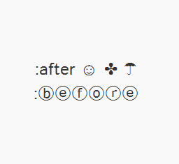
How to Use Character Entities in CSS, HTML and JavaScript

Sometimes, when using scripts, we must write special characters like accents by using a special set of codes called character entities, however these don't always look good or we get a question mark or other strange symbols. Usually, this is solved if the character encoding is done right but the logic may not always work.

In Blogger, special characters most of the time appear correctly, but when it is about other services, like external files, things can get complicated.

Create a CSS Image Slider with Thumbnails for Blogger

Image galleries/sliders are particularly useful for photoblogs, but they could also serve those who occasionally need a gadget like this. As we have seen in a previous tutorial, on the top of the main thumbnail, we have had some smaller thumbnails which were enlarged at the bottom each time an image was selected. The difference is that we had to click the thumbnail in order to show a larger version which was acquired with JavaScript.

This time will use only hover and CSS. To see it in action, visit the demo blog:

Demo blog


How to Add A CSS Image Slider with Thumbnails to Blogger

How to add a thumbnail image/photo gallery in Blogger

For those who would like to show pictures in an image gallery, here's a beautiful gallery made with JavaScript and CSS. This image gallery displays the available thumbnails either vertically or horizontally on top of the selected picture, thus making it easier for you to pick different images on mouse click.

With the help of CSS, we can make the <img> element to display on same position with the rest of the thumbs and style the thumbnails as small blocks with a defined height/width. The script will add a click-event for each <li> object that changes it's child's <img> visibility and will assign an "active" class name to the <li>.

Related:
Image Slider with Mouse Hover Effect using only CSS
Possibly the Most Simple jQuery Slider
Spacegallery: A Time Machine-like Slideshow/Image Gallery

Demo blog

Add a Cool Style to Blogger Threaded/Nested Comments

If you need a fresh style to the threaded comments of a standard Blogger template, here's a simple CSS that will help you to apply a different background, make your avatars rounded, add a border with rounded corners and a triangle which is actually an HTML entity to get that speech bubble look on your comments.

You can see a demo here.

To have this style in your comments, all you need to do is to paste the below code inside the CSS part of the template, which is between <b:skin> and </b:skin>

Styling Simple Nested Comments with CSS


Create a CSS3 Image Hover Effect with Animated Vinyl Record

Here is an amazing CSS image effect to reveal more information on your images with a really cool CSS3 hover animation. This is just perfect for blogs dedicated to music or if you just want to show off the music that you love.

So, what we will do in this tutorial is to take an image for our album cover, add some fancy CSS3 transitions and transforms that, on hover, will slide out a pure-CSS vinyl record behind it. Finally, we will add some basic HTML to our post or page where we need to apply this amazing effect.

Demo: hover over the album cover and see how CSS reveals further information:


The Wall is the eleventh studio album by the English progressive rock group Pink Floyd.

How to Apply The Animated Vinyl Record on Blogger Images


How to Increase Thumbnail Resolution on Blogger

When we add a widget on Blogger, the thumbnails will keep a default size of 72 x 72px which might not look good if we try to make them bigger using only CSS. However, with a bit of JavaScript we'll be able to replace the thumbnail with the same image of higher resolution and this way, larger images will no longer appear blurry.

In this tutorial we will see how we can replace the default thumbnail size of the popular posts widget even though we can apply this trick on any of the blog widgets.

Demo Blog.

Changing the Thumbnail Size for the Popular Posts Widget

Step 1. First, let's add the Popular posts gadget by going to Layout > click on the Add a gadget link and select Popular Posts from the popup window.

adding popular posts gadget


Tuesday, June 21, 2016

CSS3 Transition Property Basics

You can see on various blogs an interesting effect on some links. Most of the time, when you hover over a link, something changes in its style: it will either change its color or background or will become underlined. What about this cool effect that consists in gradual transition from one style to another, as you can see in this demo below:

Hover Over Me!

This transition is achieved by using the CSS3 transition property - property which is supported in all major browsers like Chrome, Firefox, Opera, Safari (for Safari we will need the -webkit- prefix to get this effect).

The CSS3 Transition Syntax

How to add custom Variable definitions to Blogger

In this post we are going learn about the CSS Variable Definitions for Colors and Fonts that could be found at the top of the style sheet of a Blogger blog. The values for the Variable definitions can be modified directly through the Blogger Template Designer where are the settings for colors, backgrounds, fonts and font sizes.
blogger variable definitions

Most default Blogger templates, such as the Minima Template, use these settings for the CSS, which makes it easier to modify these variables through the Blogger dashboard, using the "Template Designer" (Template > Customize) editor and accessing to the "Advanced" section.

blogger template designer, variable definitions

If the definitions are already established in the CSS, we'll be able to change the background colors, font colors, styles or sizes, directly from our Blogger dashboard without having to touch the HTML code of our template.

How to Add CSS code To Blogger using Template Designer

If you are having difficulties adding the CSS codes in a Blogger template, here's a short guide that will show you a more practical and fast way to add CSS (Cascading Style Sheets) so that it will be easier for you to customize your blog.

Some readers have complained that when they had to add the CSS codes to install some feature in Blogger, they found it difficult to locate the ]]></b:skin> tag. So, I decided to make this quick tutorial to show you another way of adding the CSS without having to access the Blogger HTML editor.

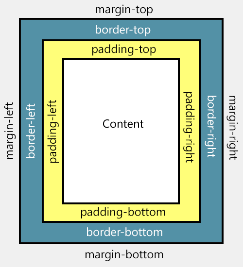
What is the difference between padding and margins?

For those who would like to know more about HTML and CSS, today we will see about the difference between margin and padding CSS properties which allow us to add blank space between the HTML elements, preventing the elements from getting 'stuck' together.

Although both possess similar functions, each has its particularity. 
  1. Padding determines the inner margins, being responsible for determining the distance between the content of a given element and its border.
  2. Margin is applied to the outside of an element affecting how far the element is away from other elements.
For more info, please take a look at the picture below:

padding and margin, css proprieties
Difference between margin and padding

Monday, June 20, 2016

Responsive CSS Timeline with 3D Effect for Blogger

Here's another amazing way to display our Blogger posts. By applying the following Responsive CSS Timeline View with 3D Effect on Blogger Posts, we will have a responsive timeline-like structure of the most recent posts and their thumbnails, along with some cool CSS effects. When clicking on the associated radio input, the posts snippet/summary will expand by changing their style and size and will rotate in 3D. The main structure of this CSS timeline with 3D effect is an unordered list.

To get an idea of what it looks like, you can visit this demo blog.

responsive CSS timeline, customize blogger posts

How to Add Responsive CSS Timeline View to Blogger Posts

Step 1. Go to Blogger dashboard > Template > click on the Edit HTML button:

blogger template, edit html

Step 2. Click anywhere inside the code area and press the CTRL + F keys to open the search box:

Tuesday, June 14, 2016

Automatically Resize Blogger Images to Fit Blog Post Area

resize blogger images automatically
Blogger offers most of the tools you would need to add and resize Blogger images quick and easy. You can upload photos directly on the platform and even change the dimensions based on the type of content that you are attempting to produce.

In order to do this, create a post and click on the small photo icon on the top toolbar next to the font style settings. A pop-up will show up on your screen asking you where you'd like to upload the image source. You have a choice between adding pictures from:

- Your local computer
- Previously uploaded images on the blog
- Picasa Web Albums
- An image URL

upload blogger image

Once you select the image that you want to use, you'll see four image sizes to choose from - small, medium, large, and x-large; it also gives you the option to determine the alignment. If you find that the four preset dimensions aren't providing the outcome you desire, there are easy ways to resize Blogger images to custom dimensions in order to fit your blog post area.

Step #1: Retain the Image Quality

If you know that you are going to need to resize Blogger images once you post them to your blog, make sure that you start with a photo larger than the 640px dimensions of the x-large option. It's easy to bring an image down in size, but if you try to make a small image bigger, you'll lose some of the quality. Just make sure that you watch out for the file size containing the image; the larger the file, the slower it will load on your website.

Photoshop is a powerful image editor that can help you to resize Blogger images or modify your images before you post, but it is also an expensive investment. There are also many other freeware image editors that can perform the simple task of resizing the photo. Determine what size you'd like the photo to display on the page and manually resize Blogger images to those dimensions; other users have found that 700px is a pretty flexible width size that works well on posts.

Once you've got your photo resized and added to your post, click on it and choose the 'Original size' option. If your photos are going to exceed the post editor, it probably means that they are larger than the body of your post, so let's fix that and make them fit exactly.

set image to original size

Step #2: Modify The Site's CSS

Next, you'll want to modify the CSS of your Blogger template to accommodate the adjustments. Don't worry; you won't need much coding experience to complete this task.

Open up the Blogger dashboard and go to 'Template' > 'Customize'. You'll see the option for 'Advanced', click on it and find your way to the 'Add CSS' tab... paste the following CSS code inside the empty box:
.post-body img {
max-width: 100%;
max-height: auto;
display: block;
margin: auto;
}
Adding the code to this section, automatically adds it between the <b:skin>....<b:skin> tags of your Template (Template > Edit HTML, above the ]]></b:skin> tag). So, no matter whether you add it above ]]></b:skin> or within the Add CSS box, the effect should be the same.

Remember that when you make changes to the CSS of the blog's Template, these changes will affect every post previously added, using the "Original size" dimension option.

To spruce up the post even more, add the last three lines shown in green below:
.post-body img {
max-width: 100%;
max-height: auto;
display: block;
margin: auto;
box-shadow: none;
border: none;
padding: 0px;
}
Screenshot

resize blogger pictures

This code will get rid of any borders and padding around the image and give it a much more natural look within the post. Hit the "Apply to Blog" button once you've finished adding it.

Note: This will only change the images set to Original size. To resize images with different sizes and apply this change on ALL the pictures added to your posts, add this CSS instead:
.post-body img {
width:100%;
height:100%;
display: block;
}
Please consider that, if you have posts with photos floating either on the right or left side of the content, they will automatically go full width.

Step #3: Create A Post

After making the adjustments to both file size and CSS, you may go back to the post editor and repeat the Step 1 to add an image. When you return to the screen that asks for size, click on the "Original size" option and confirm your choice. Your newly added image will then be displayed with the adjustments that you created, so that it fits nicely the width of the post area.

Make Blogger Header, Navigation and Footer Full Width

Blogger is a user-friendly service that provides a lot of really attractive looking default templates for those just starting out. Default templates come in handy, but the nice things about owning your own blog is that you have the chance to add your own personal touch. As a matter of fact, templates aren't made to restrict your freedom of design, but instead they're there to provide you a foundation to build from. With every default template available on Blogger, you can make changes to fit your style.

One of the most common requests out of the Blogger community when making alterations is how to change the look of some of the key sections like headers, navigation, and footers. Initially, these items are designed to fit within just 1/3 of the page, surrounded by padding and margins on either side. These margins are used to give the page a slim fitting appearance, but could also cause your content to look compressed.

Important: Backup your Template

Making the changes to a full screen Blogger navigation, footer, or header can be done and won't take you much time. Before you can make any changes, you should save extra copies of the template .xml file in case anything goes wrong. That way, if you don't like it or it doesn't come out looking like it should, you can reuse the contents of the original file to restore your blog to working condition.


Demo

Hover your mouse over the image to see a before and after example:


How to Make Header, Navigation and Footer Full Width in Blogger


Step #1: Access Your CSS File

If you've never opened up your CSS file before, log in to your Blogger account, select your blog and navigate to Template > Edit HTML. This will bring up the code of your template containing all your blog's internal files in one place.

Step #2: Modify the Background

Click anywhere inside the code area > press CTRL + F keys and type the following line > hit Enter to find it (stop at the first occurrence of it):
body {
Just below body { you should see some lines that will look like this:
body {
font: $(body.font);
color: $(body.text.color);
background: $(body.background);
padding: 0 $(content.shadow.spread) $(content.shadow.spread) $(content.shadow.spread);
$(body.background.override)
}
Where you see the highlighted line above in the code, remove the line and replace it with:
padding: 0px;
Different templates will have minor variations, but you should still be able to find these lines within every template.

Step #3: Change the Content Section

Next, search using the CTRL+F keys for this part:
.content-inner {
Just below it, you will see this line:
.content-inner {
padding: $(content.padding) $(content.padding.horizontal); 
}
Remove the line in red and replace it with:
padding: 0px;
This will remove any of the padding around the inner content, so it won't leave any room on both sides.

Now find this part:
$(content.background.color.selector){
Just below it you will see this line:
$(content.background.color.selector){
background-color: $(content.background.color);
}
Replace the line in red with:
background-color: $(body.background);
Finally, search for this tag:
]]></b:skin>
And just above it, add this CSS:
.main-outer {
background: $(content.background.color);
}

Step #4: Make the Content Outer Full Width

Content is displayed differently between browsers, so you'll next want to fix this so that it alters the width across the board. This code can be found searching for:
.content-outer, .content-fauxcolumn-outer, .region-inner {
And just below it you will see the following lines:
.content-outer, .content-fauxcolumn-outer, .region-inner {
min-width: $(content.width);
max-width: $(content.width);
_width: $(content.width);
}
Delete the line in red and replace that line with:
max-width: 100%;

Step #5: Finish It Up

Now you have just two more lines you need to change. Look for:
</b:template-skin>
And click on the right arrow to expand the styles. Note: you will need to search for </b:template-skin> tag again, and just before it you'll see these symbols highlighted in yellow:
]]>
</b:template-skin>
Above this ]]></b:template-skin> section of code, add the following:
.main-outer {
max-width: $(content.width);
margin: 0 auto;
}
Then run a search for:
]]></b:skin>
Add these lines of code just before/above it:
.tabs-inner {
padding: 0px;
}
.section {
margin: 0px;
}
.header-inner .widget {
margin: 0px;
}
Save the template and exit out of the editor.

Finished!

Following along with this tutorial won't affect or alter the pictures you are using on the blog, just the design of the content area. If you have a logo that stretches across the screen and fits perfectly for 1/3 page header, you will need to resize and re-upload this content so that it is able to work with the new adjustments.

How to Center the Blogger Header Image

The header of a website is what distinguishes your blog; it's your identity or digital fingerprint. Whenever a visitor accesses your blog for the first time, the header is one major aspect that is used to determine who you are and the type of content that they can expect to read. Therefore, it's important to develop a header that is both prominently placed and telling of your brand name.

What would seem to be counterintuitive to that idea is the default Blogger settings for header positioning. Whenever you upload a header to the site, it will automatically be aligned to the left of the page. Some Blogger users may be okay with this setting, especially if they are using a header design that doesn't contain a background. Others may find that their background headers appear cut off, incomplete, or indistinguishable from the rest of their content.

If you find yourself in the second category of users, there is a way to adjust the positioning of your header so that it is displayed as a center Blogger header. By centering your site header, you have greater flexibility over the overall design, and it allows you to really shine light on this content. It's hard to miss a header that is placed smack dab in the middle of the screen on every page that someone navigates to.

Center Header Image with Blogger Template Designer

center blogger header

Making the change is relatively easy. You'll be able to make these adjustments on every page of your Blogger blog without having to change them individually. All you need to do is to modify the CSS of your blog that can be found directly through your Blogger dashboard. Even if you have little to no experience in web design or coding, you can center Blogger header by following these next few steps.

Step 1. Log in your blogger account and select your blog, then go to "Template" and click the "Customize" button on the right side.

center blogger header

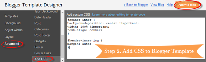
Step 2. Navigate to "Advanced" > "Add CSS" tab and paste the code in the empty box:
#header-inner {
background-position: center !important;
width: 100% !important;
text-align: center;
}
#header-inner img {
margin: auto;
}
If you have a small image and you want it to become full width, add this CSS instead:
#header-inner {
 background-size: cover;
 width: 100% !important;
 text-align: center;
 }
 #header-inner img {
 width: 100%;
 height: 100%;
 }

Step 3. Hit the ENTER key after you paste the code snippet, then click the "Apply to Blog" button.

blogger header centered

Here are some other aligning options for your headers:

Align Blogger Header Banner and Text Side by Side

Image on the right and title on the left

#header-inner {
background-position: right !important;
width: 100% !important;
}
.titlewrapper, .descriptionwrapper {
float: left;
clear: both;
margin-left: 20px;
}

Image on the left and title on the right

#header-inner {
background-position: left !important;
width: 100% !important;
}
.titlewrapper, .descriptionwrapper {
float: right;
clear: both;
margin-right: 20px;
}
Note: for larger images, you may need to resize them in order to make them appear side by side with the text.

That's it!

After making the changes to the CSS and saving your modifications, you may navigate back to your homepage. Refresh the page and you'll notice that the header is now centered, instead of on the left. Click on a few of your page links and make sure that this modification has been made to every page or post on the blog.

If by chance you don't see the changes to the header, go back through the code that you modified and make sure that you have copied and pasted the information into the file exactly as instructed. Even minor modifications in the code, or a missing semicolon may fail to make the changes you are trying to achieve, or come away with different results than what's expected.

The great thing about CSS is that it is your site's central hub for all things design. From the CSS file, you can modify just about any appearance on your site to give the blog a custom look and feel. Once you're comfortable performing minor adjustments to the appearance of your site, you can start to get creative and come up with your very own modifications.

Wednesday, September 18, 2013

Rounded Corners and Shadows for Images using CSS

Here are some unique border styles that you can apply to blogger images by using the border-radius property and defining either all four corners simultaneously or applying the rounded border only to some of them.

One of the advantages of CSS3 is that we can apply rounded borders without complicating things too much and one of the options would be to use these edges or borders to images in the blog posts, to which we can also add some hover effects such as shading and rounded borders accompanied by transitions.

Note: if you need more info about how to add rounded corners on images, follow these links:
- CSS Basics. How to Apply Rounded Corners On Images #1
- CSS Basics. How to Apply Rounded Corners On Images #2
Below are a few examples of these borders and how the images behave when you hover over them.
If you want to use one of these styles, just copy the code below the image, then go to Template, click on the Edit HTML button and paste that code before ]]></b:skin> (CTRL + F to find it)

.post-body img {
border:0;
padding:0;
-moz-transition: all 1s;
-webkit-transition: all 1s;
-o-transition: all 1s;
}
.post-body img:hover {
box-shadow: 0px 0px 15px #000; /* Shadow */
border-radius: 50%; /* Rounded border */
-moz-transition: all 1s;
-webkit-transition: all 1s;
-o-transition: all 1s;
cursor:pointer;
}
.post-body img {
background:#FFF; /* background color around the image */
padding:15px; /* space between border and image */
-moz-transition: all 1s;
-webkit-transition: all 1s;
-o-transition: all 1s;
}
.post-body img:hover {
box-shadow: 0px 0px 15px #000; /* Shadow */
border-radius: 0% 50%; /* Rounded border */
-moz-transition: all 1s;
-webkit-transition: all 1s;
-o-transition: all 1s;
cursor:pointer;
}
.post-body img {
background:#FFF; /* the background color around the image */
padding:15px; /* The Space Between Border and Image */
border-radius: 50% 0; /* Rounded border */
box-shadow: 0px 0px 15px #000; /* Shadow */
-moz-transition: all 1s;
-webkit-transition: all 1s;
-o-transition: all 1s;
}
.post-body img:hover {
border-radius:0; /* This removes the border roundness (value 0) */
-moz-transition: all 1s;
-webkit-transition: all 1s;
-o-transition: all 1s;
cursor:pointer;
}
.post-body img {
box-shadow: 0px 0px 15px #000; /* Shadow */
border-radius: 50%; /* Rounded border */
border:0;
padding:0;
-moz-transition: all 1s;
-webkit-transition: all 1s;
-o-transition: all 1s;
}
.post-body img:hover {
box-shadow: 0; /* With this we remove the shadow (value 0) */
border-radius: 0; /* This removes the border roundness (value 0) */
-moz-transition: all 1s;
-webkit-transition: all 1s;
-o-transition: all 1s;
cursor:pointer;
}
.post-body img {
border-radius: 45% / 20%; /* Rounded border */
box-shadow: 0px 0px 15px #000; /* Shadow */
padding:0;
-moz-transition: all 1s;
-webkit-transition: all 1s;
-o-transition: all 1s;
}
.post-body img:hover {
border-radius: 0; /* This removes the roundness of border (value 0) */
-moz-transition: all 1s;
-webkit-transition: all 1s;
-o-transition: all 1s;
cursor:pointer;
}
So these effects will apply to all images uploaded to your Blogger posts. But if you want to apply them only on certain pictures then change .post-body img with .rounded  and .post-body img:hover with .rounded:hoverThen add the rounded class selector in the image's code:
<img class="rounded" src="Image URL"/>
These are just some examples, however, you can modify them anytime by adding or deleting more CSS styles, it depends on everybody's tastes or needs. But as you have seen, we can make the images look way more attractive and this has been done only with CSS ;)