Tuesday, September 17, 2013

How to embed a youtube playlist on your blogger blog

In this tutorial you will see how to create a YouTube video gallery using jQuery and add the Youtube playlist to your Blogger blog. Inside this gallery/playlist, you can add your favorite youtube videos or any video that you want to share with your visitors. Because of its default dimensions (width of 765px), it is recommended to add it just below the blog header, however, you can edit CSS code to fit anywhere you want to add it.

youtube playlist for blogger

Demo here

To add this video slider/youtube playlist to your blog, please follow these steps below:

Step 1. From your blogger dashboard, go to Template > Edit HTML and click anywhere inside the code area to open the Blogger search box by pressing the CTRL + F keys.


Step 2. Type or paste the </head> tag inside the search box and hit Enter to find it.
Just above this tag, add the following scripts:

<script src='http://ajax.googleapis.com/ajax/libs/jquery/1.8.2/jquery.min.js' type='text/javascript'/>
<script>
//<![CDATA[
/*hoverscroll v.0.2.4*/
(function($) {
$.fn.hoverscroll = function(params) {
if (!params) { params = {}; }
params = $.extend({}, $.fn.hoverscroll.params, params);
this.each(function() {
var $this = $(this);
if (params.debug) {$.log('[HoverScroll] Trying to create hoverscroll on element ' + this.tagName + '#' + this.id);}
if (params.fixedArrows) {
$this.wrap('<div class="fixed-listcontainer"></div>')
}
else {
$this.wrap('<div class="listcontainer"></div>');
}

$this.addClass('list');
var listctnr = $this.parent();
listctnr.wrap('<div class="ui-widget-content hoverscroll' +
(params.rtl && !params.vertical ? " rtl" : "") + '"></div>');
//listctnr.wrap('<div class="hoverscroll"></div>');

var ctnr = listctnr.parent();

var leftArrow, rightArrow, topArrow, bottomArrow;
if (params.arrows) {
if (!params.vertical) {
if (params.fixedArrows) {
leftArrow = '<div class="fixed-arrow left"></div>';
rightArrow = '<div class="fixed-arrow right"></div>';

listctnr.before(leftArrow).after(rightArrow);
}
else {
leftArrow = '<div class="arrow left"></div>';
rightArrow = '<div class="arrow right"></div>';

listctnr.append(leftArrow).append(rightArrow);
}
}
else {
if (params.fixedArrows) {
topArrow = '<div class="fixed-arrow top"></div>';
bottomArrow = '<div class="fixed-arrow bottom"></div>';

listctnr.before(topArrow).after(bottomArrow);
}
else {
topArrow = '<div class="arrow top"></div>';
bottomArrow = '<div class="arrow bottom"></div>';

listctnr.append(topArrow).append(bottomArrow);
}
}
}
ctnr.width(params.width).height(params.height);

if (params.arrows && params.fixedArrows) {
if (params.vertical) {
topArrow = listctnr.prev();
bottomArrow = listctnr.next();

listctnr.width(params.width)
.height(params.height - (topArrow.height() + bottomArrow.height()));
}
else {
leftArrow = listctnr.prev();
rightArrow = listctnr.next();

listctnr.height(params.height)
.width(params.width - (leftArrow.width() + rightArrow.width()));
}
}
else {
listctnr.width(params.width).height(params.height);
}

var size = 0;

if (!params.vertical) {
ctnr.addClass('horizontal');
$this.children().each(function() {
$(this).addClass('item');

if ($(this).outerWidth) {
size += $(this).outerWidth(true);
}
else {
size += $(this).width() + parseInt($(this).css('padding-left')) + parseInt($(this).css('padding-right'))
+ parseInt($(this).css('margin-left')) + parseInt($(this).css('margin-right'));
}
});
$this.width(size);

if (params.debug) {
$.log('[HoverScroll] Computed content width : ' + size + 'px');
}
if (ctnr.outerWidth) {
size = ctnr.outerWidth();
}
else {
size = ctnr.width() + parseInt(ctnr.css('padding-left')) + parseInt(ctnr.css('padding-right'))
+ parseInt(ctnr.css('margin-left')) + parseInt(ctnr.css('margin-right'));
}

if (params.debug) {
$.log('[HoverScroll] Computed container width : ' + size + 'px');
}
}
else {
ctnr.addClass('vertical');
$this.children().each(function() {
$(this).addClass('item')

if ($(this).outerHeight) {
size += $(this).outerHeight(true);
}
else {
size += $(this).height() + parseInt($(this).css('padding-top')) + parseInt($(this).css('padding-bottom'))
+ parseInt($(this).css('margin-bottom')) + parseInt($(this).css('margin-bottom'));
}
});
$this.height(size);

if (params.debug) {
$.log('[HoverScroll] Computed content height : ' + size + 'px');
}
if (ctnr.outerHeight) {
size = ctnr.outerHeight();
}
else {
size = ctnr.height() + parseInt(ctnr.css('padding-top')) + parseInt(ctnr.css('padding-bottom'))
+ parseInt(ctnr.css('margin-top')) + parseInt(ctnr.css('margin-bottom'));
}

if (params.debug) {
$.log('[HoverScroll] Computed container height : ' + size + 'px');
}
}
var zone = {
1: {action: 'move', from: 0, to: 0.06 * size, direction: -1 , speed: 16},
2: {action: 'move', from: 0.06 * size, to: 0.15 * size, direction: -1 , speed: 8},
3: {action: 'move', from: 0.15 * size, to: 0.25 * size, direction: -1 , speed: 4},
4: {action: 'move', from: 0.25 * size, to: 0.4 * size, direction: -1 , speed: 2},
5: {action: 'stop', from: 0.4 * size, to: 0.6 * size},
6: {action: 'move', from: 0.6 * size, to: 0.75 * size, direction: 1 , speed: 2},
7: {action: 'move', from: 0.75 * size, to: 0.85 * size, direction: 1 , speed: 4},
8: {action: 'move', from: 0.85 * size, to: 0.94 * size, direction: 1 , speed: 8},
9: {action: 'move', from: 0.94 * size, to: size, direction: 1 , speed: 16}
}

ctnr[0].isChanging = false;
ctnr[0].direction = 0;
ctnr[0].speed = 1;
function checkMouse(x, y) {
x = x - ctnr.offset().left;
y = y - ctnr.offset().top;

var pos;
if (!params.vertical) {pos = x;}
else {pos = y;}

for (i in zone) {
if (pos >= zone[i].from && pos < zone[i].to) {
if (zone[i].action == 'move') {startMoving(zone[i].direction, zone[i].speed);}
else {stopMoving();}
}
}
}

function setArrowOpacity() {
if (!params.arrows || params.fixedArrows) {return;}

var maxScroll;
var scroll;

if (!params.vertical) {
maxScroll = listctnr[0].scrollWidth - listctnr.width();
scroll = listctnr[0].scrollLeft;
}
else {
maxScroll = listctnr[0].scrollHeight - listctnr.height();
scroll = listctnr[0].scrollTop;
}
var limit = params.arrowsOpacity;
var opacity = (scroll / maxScroll) * limit;

if (opacity > limit) { opacity = limit; }
if (isNaN(opacity)) { opacity = 0; }

var done = false;
if (opacity <= 0) {
$('div.arrow.left, div.arrow.top', ctnr).hide();
if(maxScroll > 0) {
$('div.arrow.right, div.arrow.bottom', ctnr).show().css('opacity', limit);
}
done = true;
}
if (opacity >= limit || maxScroll <= 0) {
$('div.arrow.right, div.arrow.bottom', ctnr).hide();
done = true;
}

if (!done) {
$('div.arrow.left, div.arrow.top', ctnr).show().css('opacity', opacity);
$('div.arrow.right, div.arrow.bottom', ctnr).show().css('opacity', (limit - opacity));
}
}

function startMoving(direction, speed) {
if (ctnr[0].direction != direction) {
if (params.debug) {
$.log('[HoverScroll] Starting to move. direction: ' + direction + ', speed: ' + speed);
}

stopMoving();
ctnr[0].direction = direction;
ctnr[0].isChanging = true;
move();
}
if (ctnr[0].speed != speed) {
if (params.debug) {
$.log('[HoverScroll] Changed speed: ' + speed);
}

ctnr[0].speed = speed;
}
}

function stopMoving() {
if (ctnr[0].isChanging) {
if (params.debug) {
$.log('[HoverScroll] Stoped moving');
}

ctnr[0].isChanging = false;
ctnr[0].direction = 0;
ctnr[0].speed = 1;
clearTimeout(ctnr[0].timer);
}
}

function move() {
if (ctnr[0].isChanging == false) {return;}

setArrowOpacity();

var scrollSide;
if (!params.vertical) {scrollSide = 'scrollLeft';}
else {scrollSide = 'scrollTop';}

listctnr[0][scrollSide] += ctnr[0].direction * ctnr[0].speed;
ctnr[0].timer = setTimeout(function() {move();}, 50);
}

if (params.rtl && !params.vertical) {
listctnr[0].scrollLeft = listctnr[0].scrollWidth - listctnr.width();
}

ctnr
.mousemove(function(e) {checkMouse(e.pageX, e.pageY);})
.bind('mouseleave', function() {stopMoving();});

this.startMoving = startMoving;
this.stopMoving = stopMoving;

if (params.arrows && !params.fixedArrows) {
// Initialise arrow opacity
setArrowOpacity();
}
else {
// Hide arrows
$('.arrowleft, .arrowright, .arrowtop, .arrowbottom', ctnr).hide();
}
});

return this;
};

if (!$.fn.offset) {
$.fn.offset = function() {
this.left = this.top = 0;

if (this[0] && this[0].offsetParent) {
var obj = this[0];
do {
this.left += obj.offsetLeft;
this.top += obj.offsetTop;
} while (obj = obj.offsetParent);
}

return this;
}
}

$.fn.hoverscroll.params = {
vertical: false,
width: 400,
height: 50,
arrows: true,
arrowsOpacity: 0.7,
fixedArrows: false,
rtl: false,
debug: false
};
$.log = function() {
try {console.log.apply(console, arguments);}
catch (e) {
try {opera.postError.apply(opera, arguments);}
catch (e) {}
}
};
})(jQuery);

$(function(){
$("#videoslider-tabs a").click(function(){
var container = $("#videoslider-content");
container.html("<img src='https://blogger.googleusercontent.com/img/b/R29vZ2xl/AVvXsEhntVY8l5OmrVQk4ZjnGiz8p78ovR3AjNN3y_JtcvHt52879tpOa6rvH8DCJUgVKf2qs88GRqhyGMCXrQsf1NMVHG5dyFHs6y3hGt6oXjbWpBKvEgWAfX1u5837Ro1joSQJ0_AWBKUI71Ws/s1600/loading.png' class='loading-vid' />");
var id = $(this).attr("href").slice(1);
loadvideo(id);
return false;
});
$("#videoslider-tabs").hoverscroll({vertical:true,width:300,height:330,arrows:false});
$("#videoslider-tabs li").hover(function(){$(this).addClass("hover");},function(){$(this).removeClass("hover");});
loadvideo();
});

function loadvideo (hash){if(hash){hash = hash.slice(3);$("#videoslider-content").html(video[hash]);$("#videoslider-tabs li").removeClass("actVid");$("#videoslider-tabs a[href=#vid"+hash+"]").parent().addClass("actVid");}else{$("#videoslider-content").html(video[1]);$("#videoslider-tabs li").removeClass("actVid");$("#videoslider-tabs a[href=#vid1]").parent().addClass("actVid");}}
//]]>
</script>

Step 3. Now let's add the CSS code. Just above the same </head> tag, add this code:
<style>
#videoslider {
background:#F6F6F6; /* Background color */
clear:both;
margin:0 auto;
padding:5px;
width:735px;
border-radius: 5px;
border: 1px solid #C1C1C1;
-moz-background-clip: padding;
-webkit-background-clip: padding-box;
background-clip: padding-box;
}
#videoslider, #videoslider-content, #videoslider-tabs {
height:340px;
}
#videoslider-content {
color:#fff;
float:left;
text-align:center;
width:430px;
z-index:1;
}
.loading-vid {
display:block;
margin:165px auto 0;
}
#videoslider-tabs {
float:right;
width:240px;
margin:0;
}
#videoslider-tabs li {
background-color:#F6F6F6;
border: 1px solid #C1C1C1;
float:left;
height:60px;
padding:5px;
width:240px;
list-style:none;
overflow: hidden;
}
#videoslider-tabs li a {
padding:0 !important;
border:0 !important;
}
#videoslider-tabs li.hover {
background-color:#EBEBEB;
}
#videoslider-tabs li.actVid {
background:#555;
}
#videoslider-tabs li img.thumb-vid {
background-color:#EEEEEE;
float:left;
height:52px;
margin:0 8px 0 0;
padding:5px;
width:52px;
}
#videoslider-tabs li span.vidTit {
display:block;
color:#128EC9; /* Titles color */
font-size:12px; /* Titles font size */
font-weight:bold;
text-decoration:none;
}
#videoslider-tabs li .vidDesc {
display:block;
color:#222222; /* Color of the description */
font-size:11px; /* Font size of the description */
font-weight:bold;
text-decoration:none;
}
#videoslider-tabs a {
text-decoration:none;
}
#videoslider-tabs li.actVid .vidDesc {
color:#fff;
}
#videoslider-tabs li span.vidTit .actVid {
color:#fff; /* Titles color */
}
.ui-widget-content{
float:right;
overflow-y: scroll;
overflow-x: hidden;
}
.tabs-outer {
background-image: none !important;
}
#videoslider-tabs li a:hover {
background: none !important;
}</style>
Step 4. Click on the Save Template button

To make this youtube playlist work we need to add the HTML structure of it:

Step 5. Go to Layout or Pages or anywhere you want to add it and add the following code inside the HTML area (if you want to add it as a widget, paste the code inside a HTML/Javascript gadget by clicking on Add a gadget link within the Layout/Page Elements section):
<script>
var video = [];
video[1] = '<iframe width="460" height="345" src="http://www.youtube.com/embed/video_ID_1" frameborder="0" allowfullscreen></iframe>';
video[2] = '<iframe width="460" height="345" src="http://www.youtube.com/embed/video_ID_2" frameborder="0" allowfullscreen></iframe>';
video[3] = '<iframe width="460" height="345" src="http://www.youtube.com/embed/video_ID_3" frameborder="0" allowfullscreen></iframe>';
video[4] = '<iframe width="460" height="345" src="http://www.youtube.com/embed/video_ID_4" frameborder="0" allowfullscreen></iframe>';
video[5] = '<iframe width="460" height="345" src="http://www.youtube.com/embed/video_ID_5" frameborder="0" allowfullscreen></iframe>';
</script>
<div id="videoslider">
<div id="videoslider-content"></div>
<ul id="videoslider-tabs">
<li><a href="#vid1"><img src="//i2.ytimg.com/vi/video_ID_1/default.jpg" class="thumb-vid" /><span class="vidTit">Video Name</span><span class="vidDesc">Video Description</span></a></li>

<li><a href="#vid2"><img src="//i2.ytimg.com/vi/video_ID_2/default.jpg" class="thumb-vid" /><span class="vidTit">Video Name</span><span class="vidDesc">Video Description</span></a></li>

<li><a href="#vid3"><img src="//i2.ytimg.com/vi/video_ID_3/default.jpg" class="thumb-vid" /><span class="vidTit">Video Name</span><span class="vidDesc">Video Description</span></a></li>

<li><a href="#vid4"><img src="//i2.ytimg.com/vi/video_ID_4/default.jpg" class="thumb-vid" /><span class="vidTit">Video Name</span><span class="vidDesc">Video Description</span></a></li>

<li><a href="#vid5"><img src="//i2.ytimg.com/vi/video_ID_5/default.jpg" class="thumb-vid" /><span class="vidTit">Video Name</span><span class="vidDesc">Video Description</span></a></li>
</ul>
</div>

Add the IDs of your videos to where it says video_ID_..., titles (Video Name) and a brief description (Description). To get the ID of a video, open the video on YouTube and look at the address bar - you need only the last characters after "v="


Note that each video ID should be added two times, the ones in red are for the video and the ones in orange are for the tabs thumbnail.

To add more videos, add two lines like the ones in bold above and then change the video[] and #vid... number. If you decided to add it inside a post or page, please make sure that you don't switch back to the Compose tab and publish your post while you're still on the HTML tab, otherwise the #vid location will be replaced with some other odd Blogger URLs.

Thursday, September 5, 2013

Making a gadget visible only to the blog administrator

And the post title says it all. There are gadgets that sometimes we want to be visible only to us and not to our blog readers, perhaps a Survey already ended that we want to keep, a counter, or any gadget that while we customize, we don't want anyone else to see until the final result is ready.
blogger widgets, blogger tutorials
 The procedure is simple, we just have to add two lines to our gadget that we want to hide.

First thing to do is to go to Template > Edit HTML and then search for the gadget's code we want to hide. It will be easier using the CTRL + F keys and locating the name of the gadget/widget.

For example, in a HTML/Javascript gadget, we will see a code like this:
<b:widget id='HTML1' locked='false' title='' type='HTML'>
<b:includable id='main'>
<span class='item-control blog-admin'>
<!-- only display title if it's non-empty -->
<b:if cond='data:title != &quot;&quot;'>
<h2 class='title'><data:title/></h2>
</b:if>
<div class='widget-content'>
<data:content/>
</div>

<b:include name='quickedit'/>
</span>
</b:includable>
</b:widget>
All you have to do is add the parts in red and ready. If you close the session go to your blog you'll not be able to view the gadget that you have hidden, but as soon as you sign in you will see that it is visible to you.
Not all gadgets have the same structure like in my example, but it will be easier to guide you, just place the first code in red just after <b:includable id='main'>

And the second red code just before </b:includable>
Note: to look inside the widget's code, click on the sideways arrow next to the widget's id.

And with that the gadget will be hidden for readers except you.

Wednesday, September 4, 2013

Upload images and get the URL of the image

As each day there are lots of new users joining the world of blogging, it's good to know about some basic topics that would raise some recurring questions such as how we could get the URL of an image?

There are many both free as well as paid web hosting services on the web where we can host images, but since we use Blogger, there is nothing better than using the same hosting service that Google gives us, which is Picasa.

How to Upload Images in Blogger & Get Image URL

The fastest way to upload an image is through the Blogger post editor: from your Blogger Dashboard, go to your blog and click the New post button. Once the post editor opens, go to the HTML tab and click the image icon.


When the pop-up window appears, click the Choose files button, browse for your image(s), double click or click Open and hit Add selected.

After the image has been uploaded, you will see the HTML code of the image in the post editor as in the screenshot below.


That code contains the URL of your photo. The two URLs (web addresses) that you will see, would look something similar to this:
<a href="https://blogger.googleusercontent.com/img/b/R29vZ2xl/AVvXsEgSe0DOxzS7dbNccxXQIGfEhYL1ZulQzJni9OBpiggmjZ8QASVrqPtalx9y7KJeKnfTI8Kx-4CN-hIEfghuXjC01HCRPusxLmZtAVzcUrDud_Nm0qc20Z8kBPXOmgcNFigcxkz-rBK2q8Ca/s1600/Bliss-Windows-XP.png" imageanchor="1"><img border="0" src="https://blogger.googleusercontent.com/img/b/R29vZ2xl/AVvXsEgSe0DOxzS7dbNccxXQIGfEhYL1ZulQzJni9OBpiggmjZ8QASVrqPtalx9y7KJeKnfTI8Kx-4CN-hIEfghuXjC01HCRPusxLmZtAVzcUrDud_Nm0qc20Z8kBPXOmgcNFigcxkz-rBK2q8Ca/s320/Bliss-Windows-XP.png" /></a>
The first is the URL of the image that you need to copy. It's not required to publish this post where you uploaded the photo; you might as well leave it as Draft or delete it. The image will be saved anyway on PicasaWeb (unless when you removed the draft, you have also selected the option to remove the image).

How to Upload Photos to Picasa and get Image URL

Now that you know how to upload an image through Blogger, you can also upload image directly from Picasa:

Just login to PicasaWeb, select the album where you want to host the image, and click Add photos.


Select the image from a location on your computer and upload it.


After it has been uploaded, click OK. Now you will see the thumbnail, along with other photos if there are more.

To get the URL of the image from Picasa, click the image to open in full size, then right click on the picture and select the following option depending on the browser you are using:

For Google Chrome > select Copy Image URL:


If you are using Mozilla Firefox  > select Copy Image Location:


For Opera > select Copy Image URL:


For Safari > select Copy Image Address:


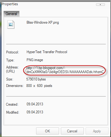
If you are using Internet Explorer (I hope not) > first select Properties, a window will open and there you will find the Address section from where you can select the URL of the image. Just copy it:


After you have selected any of these options, you'll have the URL of the image copied to the clipboard. It's that easy!

Now that you know how to upload images and get the URL, it's highly recommended to Optimize Images for Better SEO.

Remember that all images you upload on Blogger, are stored in your Picasa account. So, if you find an image previously uploaded on your blog, just go to your Picasa account, select the album containing the name of your blog and find the picture you need. The method to get the URL of the image is the same as explained above.

Tuesday, September 3, 2013

Possibly the most simple jQuery Slider

Do you have jQuery in your site or blog and space to insert 10 lines of code? If the answer is yes, and you want to have an automatic slideshow, this is the simplest code I've seen so far. So, having a succession of images added inside a box with a common general container, would give this result:
jquery slider for blogger, slideshows


Related: Image Slider using only CSS

How to add a Simple jQuery Slider to Blogger

Step 1. Adding the JavaScript

If you don't have jQuery, then you should add this line just above the </head> tag to make the slideshow work:
<script src='http://ajax.googleapis.com/ajax/libs/jquery/1.8/jquery.min.js' type='text/javascript'/>
Where the </head> tag can be found? Go to Template > Edit HTML > click anywhere inside the code area and press the CTRL + F keys. Inside the search box, type this tag and hit Enter to find it:
</head>

Once confident that you have the library in your template, let's add the below script as well, which will make the set of images load as a slider:
<script type="text/javascript">//<![CDATA[
$(function(){
    $('#slider div:gt(0)').hide();
    setInterval(function(){
      $('#slider div:first-child').fadeOut(0)
         .next('div').fadeIn(1000)
         .end().appendTo('#slider');}, 4000);
});
//]]></script>
Finally, save the changes by clicking the "Save Template" button. And now, that we finished adding the scripts, let's add the images to where we want to show...

2. Create/Add the HTML for the Slider

After implementing the above scripts in the template (although, we could add them directly into a gadget, on a page or even inside the post HTML), we will create the slider like the one above.

Use the following HTML structure to show the image slider:
<div id="slider">
    <div><img src="IMAGE_URL"/></div>
    <div><img src="IMAGE_URL"/></div>
    <div><img src="IMAGE_URL"/></div>
</div>
- as a gadget: go to Layout, click "Add a gadget" and choose the "HTML/JavaScript" option
- inside a post/page: create a new post and paste the code inside the HTML box.

So this is all you need. For me, it is quite lightweight and efficient, much more than most libraries that are used nowadays - perhaps, too often.

jQuery Slider Settings

The last three numbers of this slider will allow us to adjust some things. All of them are expressed in milliseconds (4000 = 4 seconds):

fadeOut(0): Time for the outgoing image
fadeIn(1000): Time for the next image
('#slider');},4000): Time spent in each image

How it Works

$('#slider div:gt(0)').hide();
With gt(x) we select all the divs from the number (x). In this case, 0 is the first, so what this line does is to hide (hide()) all the boxes - except the first, that will be the image visible initially.

setInterval(function(){ [what we will do] }, 4000);
We need to reiterate a few things from time to time and we can accomplish this with setInterval - the delay time between each set.

$('#slider div:first-child').fadeOut(0)
Within each of these intervals, we remove (fadeOut) the first box (div:first-child) with a fade out effect, so that images are out of visibility...

.next('div').fadeIn(1000)
...and make the following box (next) to appear gradually (fadeIn).

.end().appendTo('#slider');
Finally, this will show the first image and will move it to the end (appendTo) of the "list".

end() resets the number of elements that we move forward with next(). Thus, the first child made earlier to disappear, is the one that is sent down the stack, and not the image that is currently visible.

3. Customizing the Slider

Even though, we don't need CSS to make the slider work, we can still change its look to display images in different sizes, include captions, or even improve the transition. Here are some ideas:

Text 1
Text 2
Text 3
This is a long text 4

In the above example, we limited the size of the container and prevented the overflow of larger images. Finally, we added rounded borders and centered the slider.
#slider {
overflow: hidden;
width: 500px;
height: 300px;
border:3px solid #242424;
border-radius: 40px;
margin: 0 auto;
padding: 0;
position: relative;
}
If we would have made the parent box of the images positioned absolutely, they would have overlapped each other. For this reason, we have set the "position" of the container to "relative".

As for the images, we will set the width to 100% to make them fill the entire container and the min-height to 300px, to fill up all the available height of the parent box, so that there will be no empty space around them.
#slider > div {
position:absolute;
top:0;
left:0;
}
#slider img {
width:100%;
min-height:300px;
margin:0;
padding:0;
border:0;
}
To add more elements like a text or caption, we will enclose the text in span tags and will set the position to "absolute". And to make the text appear at the bottom of the image, we will use the bottom property:
#slider span {
position: absolute;
bottom: 17px;
display: block;
width: 100%;
margin:0;
padding: 15px 0;
color: #fff;
background: #242424;
font-size: 18px;
line-height:18px;
text-align:center;
}
If you want change the look of this slider - go to Template, hit the Customize button and click on the Advanced > Add CSS tab and paste the above CSS codes inside the empty box.

The HTML markup for this last example, would look like this:
<div id="slider">
<div><a href="Link_URL1"><img src="Image_URL1" /></a><span>TEXT1</span></div>
<div><a href="Link_URL2"><img src="Image_URL2" /></a><span>TEXT2</span></div>
<div><a href="Link_URL3"><img src="Image_URL3" /></a><span>TEXT3</span></div>
</div>
Please note that if you add it inside the post's HTML, don't switch back to the compose tab, as this might remove the span tags of the image captions and the text might not be displayed properly.

Sunday, June 2, 2013

Horizontal menu with sub-tabs in two columns for Blogger

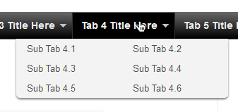
This is a very nice horizontal menu in which its sub-tabs are displayed in two columns and is also made with CSS, without any scripts.
blogger navigation menu, css menu, drop-down menu
The "advantage" so to speak, is that the sub-tabs when arranged in two columns are not very long, so it will be neat and less space along. You can see an example here:


Adding A Horizontal Menu With Sub Tabs in Two Columns To Blogger

STEP 1: In Blogger, go to your "Layout" and on the "Page Elements" section.
  • Click on the "Add a Gadget" link just under your header image
  • From the Gadget's List, select "HTML/JavaScript" option.
STEP 2: Simply copy and paste this ENTIRE code into your widget. Note: Leave the "Title" section of this widget blank.
<div id='menucol'>
<div id='topwrapper'>
<ul id='top'>
<li><a href='http://YOUR URL HERE.com'>Tab 1 Title Here</a></li>
<li><a href='http://YOUR URL HERE.com'>Tab 2 Title Here</a></li>
<li><a class='submenucol' href='#'>Tab 3 Title Here</a>
<ul>
<li><a href='http://YOUR URL HERE.com'>Sub Tab 3.1</a></li>
<li><a href='http://YOUR URL HERE.com'>Sub Tab 3.2</a></li>
<li><a href='http://YOUR URL HERE.com'>Sub Tab 3.3</a></li>
<li><a href='http://YOUR URL HERE.com'>Sub Tab 3.4</a></li>
<li><a href='http://YOUR URL HERE.com'>Sub Tab 3.5</a></li>
<li><a href='http://YOUR URL HERE.com'>Sub Tab 3.6</a></li>
</ul>
</li>
<li><a class='submenucol' href='#'>Tab 4 Title Here</a>
<ul>
<li><a href='http://YOUR URL HERE.com'>Sub Tab 4.1</a></li>
<li><a href='http://YOUR URL HERE.com'>Sub Tab 4.2</a></li>
<li><a href='http://YOUR URL HERE.com'>Sub Tab 4.3</a></li>
<li><a href='http://YOUR URL HERE.com'>Sub Tab 4.4</a></li>
<li><a href='http://YOUR URL HERE.com'>Sub Tab 4.5</a></li>
<li><a href='http://YOUR URL HERE.com'>Sub Tab 4.6</a></li>
</ul>
</li>
<li><a class='submenucol' href='#'>Tab 5 Title Here</a>
<ul>
<li><a href='http://YOUR URL HERE.com'>Sub Tab 5.1</a></li>
<li><a href='http://YOUR URL HERE.com'>Sub Tab 5.2</a></li>
<li><a href='http://YOUR URL HERE.com'>Sub Tab 5.3</a></li>
<li><a href='http://YOUR URL HERE.com'>Sub Tab 5.4</a></li>
<li><a href='http://YOUR URL HERE.com'>Sub Tab 5.5</a></li>
<li><a href='http://YOUR URL HERE.com'>Sub Tab 5.6</a></li>
<li><a href='http://YOUR URL HERE.com'>Sub Tab 5.7</a></li>
<li><a href='http://YOUR URL HERE.com'>Sub Tab 5.8</a></li>
</ul>
</li>
<li><a href='http://YOUR URL HERE.com'>Tab 6 Title Here</a></li>

</ul>
<br class='clearit'/>
</div>
</div>
Customize your main tabs by changing the Tab Titles to whatever you want. Include a URL for each one if you want it to be 'clickable'. If not, you can just put a # sign where it says http://YOUR URL HERE.com

You can add or delete as many of the main tabs as you need, just make sure to copy the entire code for the main tab for each additional tab you want:
<li><a href='http://YOUR URL HERE.com'>Tab 7 Title Here</a>
<ul>
<li><a href='http://YOUR URL HERE.com'>Sub Tab 7.1</a></li>
<li><a href='http://YOUR URL HERE.com'>Sub Tab 7.2</a></li>
<li><a href='http://YOUR URL HERE.com'>Sub Tab 7.3</a></li>
</ul>
</li>
STEP 3: Now let's go a step further and add the CSS style in our Template
  • Go to Template > Edit HTML
  • Click on the sideways arrow next to <b:skin>...</b:skin> 

  • Then click anywhere inside the code area and search - using CTRL + F keys - for the ]]></b:skin> tag and just above ]]></b:skin> add this code:
/* Horizontal menu with 2 columns
----------------------------------------------- */
#menucol {
width:940px;
height:37px;
background-image: -moz-linear-gradient(top, #666666, #000000);
background-image: -webkit-gradient(linear, left top, left bottom, color-stop(0.00, #666666), color-stop(1.0, #000000));
filter: progid:DXImageTransform.Microsoft.Gradient(gradientType=0,startColorStr=#666666,endColorStr=#000000);
border-bottom:1px solid #666666;
border-top:1px solid #666666;
margin:0 auto;padding:0 auto;
overflow:hidden;
}
#topwrapper {
width:940px;
height:40px;
margin:0 auto;
padding:0 auto;
}
.clearit {
clear: both;
height: 0;
line-height: 0.0;
font-size: 0;
}
#top {
width:100%;
}
#top, #top ul {
padding: 0;
margin: 0;
list-style: none;
}
#top a {
border-right:1px solid #333333;
text-align:left;
display: block;
text-decoration: none;
padding:10px 12px 11px;
font:bold 14px Arial;
text-transform:none;
color:#eee;
}
#top a:hover {
background:#000000;
color:#F6F6F6;
}
#top a.submenucol {
background-image: url(https://blogger.googleusercontent.com/img/b/R29vZ2xl/AVvXsEi-apjiEEKWfDlcpvGIZgbRl6ZK8yl058OsTEyQ_hwoOSMFn0yayAF8fiQJjdnWPRKvfjUPC7gXzz3ES97pDXRQ1320LjjI_uL3fTN83Q59LcBUUPfTpPRkKWJCTKjSNaD0V8IWO6aSAuI/s1600/arrow_white.gif);
background-repeat: no-repeat;
padding: 10px 24px 11px 12px;
background-position: right center;
}
#top li {
float: left;
position: relative;
}
#top li {
position: static !important;
width: auto;
}
#top li ul, #top ul li {
width:300px;
}
#top ul li a {
text-align:left;
padding: 6px 15px;
font-size:13px;
font-weight:normal;
text-transform:none;
font-family:Arial, sans-serif;
border:none;
}
#top li ul {
z-index:100;
position: absolute;
display: none;
background-color:#F1F1F1;
margin-left:-80px;
padding:10px 0;
border-radius: 0px 0px 6px 6px;
box-shadow:0 2px 2px rgba(0,0,0,0.6);
filter:alpha(opacity=87);
opacity:.87;
}
#top li ul li {
width:150px;
float:left;
margin:0;
padding:0;
}
#top li:hover ul, #top li.hvr ul {
display: block;
}
#top li:hover ul a, #top li.hvr ul a {
color:#333;
background-color:transparent;
text-decoration:none;
}
#top ul a:hover {
text-decoration:underline!important;
color:#444444 !important;
}
  • Now find (CTRL + F) this line:
/* Tabs
  • It will also have some little lines beneath:
/* Tabs
----------------------------------------------- */
  • And just below these little lines, delete the code below until you reach at:
/* Columns
----------------------------------------------- */
  • Instead of the code that you have removed, add this one:
#crosscol ul {z-index: 200; padding:0 !important;}
#crosscol li:hover {position:relative;}
#crosscol ul li {padding:0 !important;}
.tabs-outer {z-index:1;}
.tabs-inner {padding: 0 0px;}
See this screenshot for more info:
menu for blogger, blogger gadgets, blogger widgets
STEP 4: The final step is to Save the Template and you are done!

Visit your blog to see a beautiful navigation menu just below header.
If you have any questions or need help, leave a comment below.

Fade In/Out Page Loading Effect On Blogger Posts

A very common effect in jQuery is the fade effect that hides or shows an element by fading it, and we can use it in many ways as for example in the blog's navigation. The following script does just that, by loading the page with a fading effect when we browse on internal links that are in the blog, such as post titles, labels links, archive, navigation links, etc..
jQuery effect, fade in effect, blogger jQuery
You can see an example in this demo blog, click on the title of any post and see the fading effect when the page is loading.

How To Implement the Fade In Loading Effect

1) To put this fading effect on your blog, go to your Template > Edit HTML :

fading effect, blogger blogspot, blogger tricks

2) Click anywhere inside the code area and search for the </head> tag using CTRL + F keys:


3) Then, just above </head> add the following code:
<script src='http://ajax.googleapis.com/ajax/libs/jquery/1.8.2/jquery.min.js' type='text/javascript'/>
<script type='text/javascript'>
//<![CDATA[
$(document).ready(function() {
$("body").css("z-index", "-10");
$("body").fadeIn(0);

$("a").click(function(event){
event.preventDefault();
linkLocation = this.href;
$("body").fadeOut(500, redirectPage); });
function redirectPage() {
window.location = linkLocation;
}
});
//]]>
</script>
<style>
html {
background-color: #F2F2F2; /* Color fading */
}
</style>
4) Save the changes and that's it. In green you can see where to change the color that fades on a loading page.

The original script hides the body of the page while loading, I prefer to change that property with a negative z-index to avoid problems with the search engine robots that may effect the positioning.

Problems?

Consider that such effects could increase the blog loading time, so I recommend using it only when your blog loads fast and does not have too many scripts.

If you already use another version of jQuery remove the other, leaving only this which will be readed first.

If you are using Mootools or Scriptaculous, then you have to make some modifications to the code in order to be compatible.
If you have another script with a fade effect, then it could interfere with this and you might not see anything on the page except the color fading, in such cases it is better without this script.

You can also use this effect only on some links, for example, if you want to appear only when you click on the post titles in the navigation links (older posts and newer posts), and on the top tabs, then replace this line:
$("a").click(function(event){
With this:
$(".post-title a, .blog-pager-older-link, .blog-pager-newer-link, .tabs").click(function(event){
In some cases, the page can load for a second and then load with the fade effect, this may be "normal" because the browser is slow to read the script on page load.

Apart from these drawbacks, I think it's a very elegant way to load blog pages while browsing them, don't you think?

Saturday, June 1, 2013

Using the :before and :after Pseudo Elements on Sidebar Titles

This is another method of using the :after and :before properties and it will work without too many problems in any browser, including IE8. What this trick will do is to divide the header bar into left and right sections, where the left will contain an explanatory title and the right, a related link.

The idea of generating Adobe-like Arrow Headers was actually discussed by css-tricks and adapted to Blogger.

How to Add Adobe-like Headers to Blogger

blogger gadgets, blogger tricks, blogger blogspot

Step 1. Log in to your Blogger dashboard > go to Template > Edit HTML, then click anywhere inside the code area to search - using the CTRL + F keys - for the following tag:
</head>
Step 2. Just above it, copy and paste this code:
 <style>
.module h2 {
  background-color: #D5D5D5;
  border-radius: 20px 0 0 20px;
  color: #FFFFFF;
  font-family: Verdana;
  font-size: 14px;
  line-height: 32px;
  margin: 0;
  padding: 0 0 0 20px;
  text-shadow: 2px 1px 1px #222;
}

.module h2 a {
    border-left: 5px solid #ffffff;
    color: #101921;
    float: right;
    font-size: 14px;
    text-decoration: none;
    text-shadow: none;
    padding: 0 10px;
    position: relative;
   -moz-transition: padding 0.1s linear;
   -webkit-transition: padding 0.1s linear;
   -ms-transition: padding 0.1s linear;
   -o-transition: padding 0.1s linear;
}
.module h2 a:hover {
  padding: 0 32px;
}

.module h2 a:before, .module h2 a:after {
    content: &quot;&quot;;
    height: 0;
    position: absolute;
    top: 50%;
    width: 0;
}
.module h2 a:before {
    border-bottom: 8px solid transparent;
    border-right: 8px solid #ffffff;
    border-top: 8px solid transparent;
    left: -12px;
    margin-top: -8px;
}
.module h2 a:after {
    border-bottom: 6px solid transparent;
    border-top: 6px solid transparent;
    left: -6px;
    margin-top: -6px;
}

.module.blue h2 a {background-color: #A2D5EC;}
.module.blue h2 a:hover {background-color: #C5F0FF;}
.module.blue h2 a:after {border-right: 6px solid #A2D5EC;}
.module.blue h2 a:hover:after {border-right-color: #C5F0FF;}

.module.yellow h2 a {background-color: #FCE98D;}
.module.yellow h2 a:hover {background-color: #FFD700;}
.module.yellow h2 a:after {border-right: 6px solid #FCE98D;}
.module.yellow h2 a:hover:after {border-right-color: #FFD700;}

.module.green h2 a {background-color: #bada55;}
.module.green h2 a:hover {background: #C7E176;}
.module.green h2 a:after {border-right: 6px solid #bada55;}
.module.green h2 a:hover:after {border-right-color: #C7E176;}

.module.red h2 a {background-color: #F0A5B5;}
.module.red h2 a:hover {background-color: #FFC7D2;}
.module.red h2 a:after {border-right: 6px solid #F0A5B5;}
.module.red h2 a:hover:after {border-right-color: #FFC7D2;}
</style>
Step 3. Save the Template.

Screenshot:


Step 4. Now go to Layout and Add a new HTML/JavaScript Gadget with one of the codes below for each of the widget title:

Background in blue:
<div class="module blue">
<h2>Title in <a href="Link URL">Blue</a></h2>
</div>
Background in yellow:
<div class="module yellow">
<h2>Title in <a href="Link URL">Yellow</a></h2>
</div>
Background in green:
<div class="module green">
<h2>Title in <a href="Link URL">Green</a></h2>
</div>
Background in red:
<div class="module red">
<h2>Title in <a href="Link URL">Red</a></h2>
</div>

Note: Change "Title in" text with your widget's title and Blue, Yellow, Green and Red with the text on the right, then add a Link URL to it.
Step 5. After you saved the HTML/Javascript gadgets containing the codes above, drag and drop them just above the widgets you want to show... and Save the Arrangement.
blogger tricks, blogger tutorials

DEMO

You can see how the sidebar titles has been replaced with some cool header bars on this demo blog.